I decided to try out a range of ideas to give me more options for the final material to use. A logo is meant to be easily recognizable and iconic; this allows the production company to be identified easily.

Looking at examples of existing logos I have found that styles vary, and give the company a distinct face. From my drafts I plan to narrow down my ideas and designs and incorporate them into my final logo.
For the production company name text, I created my own font. This was achieved by selecting two fonts from Microsoft word then printing off all the words of each in an alphabet. Now that I had both alphabets I carefully cut them out with a penknife and cut them up to merge into both letters. When they had a suitable unique look I glued them together and scanned it.
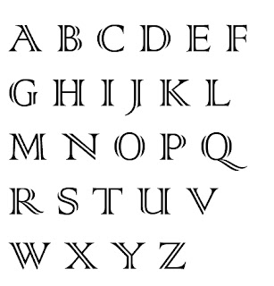
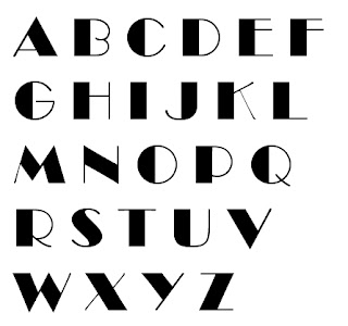
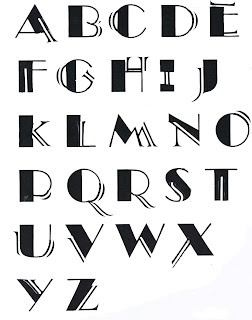
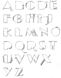
For the production company name text, I created my own font. This was achieved by selecting two fonts from Microsoft word then printing off all the words of each in an alphabet. Now that I had both alphabets I carefully cut them out with a penknife and cut them up to merge into both letters. When they had a suitable unique look I glued them together and scanned it.


Once they had been uploaded to my computer I sent the images to Photoshop and cut each letter I needed and placed them on a PNG background so that they could be placed, like the robot image, seamlessly on any image or film.

Using my drafts as a guideline I decided to build a logo from scratch, from the font to the image. To create the image I went to the art workshop at Wyke College and gathered various materials to create a robot. Items in its construction ranged from machine parts to old antiques. I arranged these parts into the form of a robot and then used my digital camera to take photos of it.


Once this had been done, I uploaded it onto my computer for editing. Beforehand I had placed my robot structure on white card; this made it easy to cut away the background in Photoshop. Once this had been done I applied a filter to the image, this gave it a very metallic look and helped it stand out.
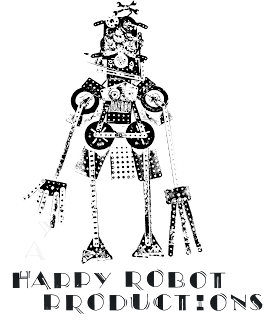

After the filter had been applied I converted the background image to be PNG, this made the image free to be placed on any image or film seamlessly.
While creating my Logo in photoshop I had the idea to create a film billboard at the same time, as my Logo would be on this to.
While creating my Logo in photoshop I had the idea to create a film billboard at the same time, as my Logo would be on this to.
I looked at examples of film billboards (The example shown below is from the film stardust) this gave me a guildine on what the format of a filmboard should be and how I should create mine appropriatly.
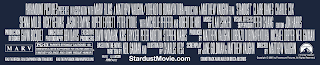
Shown below is my finished billboard which I will use in the film. It features my logo, production staff names and production company name.


This was my original film company name and logo. I used my custom text that I created with a number of filters in photoshop to give it a striking but simple effect.


These are two graphic designs I created as drafts for a possible logo. I created these from scratch using photoshop.
No comments:
Post a Comment